Charts
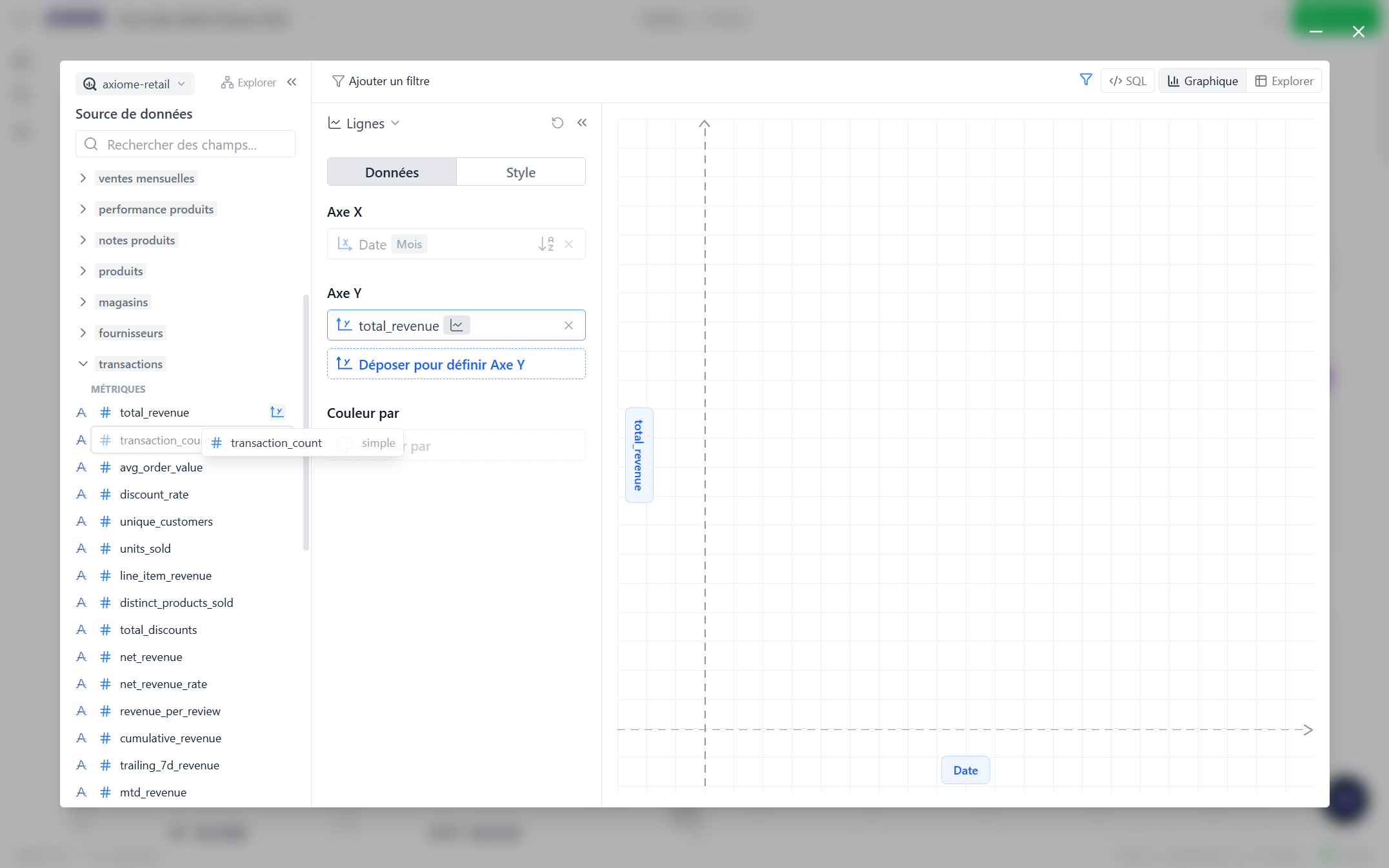
Charts are built by dragging fields — no formulas, no code. To open a chart's editor, hover it on the dashboard and click the pencil (Edit chart); a chart you haven't configured yet opens on a single click. Pick a chart type (bar, line, area, scatter, or pie) in the top-left of the editor and switch anytime; your setup follows along.
Editing a chart needs the dashboard in Edit mode. In View mode charts are read-only — see Edit mode and View mode.
Set up the data
The Data Source panel lists your fields, grouped as Dimensions, Measures, and Metrics. Drag them onto the chart's slots:
- X-axis (or Label for a pie) — usually a dimension. Dates can be grouped by minute, hour, day, week, month, quarter, or year (the finer grains appear only on fields that carry a time of day).
- Y-axis (or Value) — a metric, a measure, or a number with the aggregation of your choice (sum, average, median, count…). You can plot several series, even with a left and a right axis.
- Color by — split a series into one colored line/bar per value: revenue by country, sign-ups by plan…
Grayed-out fields simply can't be combined with what's already on the chart — pick a related field instead.
Axiome would rather show nothing than a wrong number, so it explains in plain language when a combination can't produce a correct result — usually naming the field at fault. Most of these are fixed once, in the data setup: if you keep hitting one, send it to your administrator along with How queries work, and their errors.
Not sure what's in your data?
Click Data map in the editor to see the tables available on this connection and how they relate. Handy when you're new to a dataset and don't yet know which fields go together. The same map is available from the Explore panel on the dashboard itself.
Build a field that doesn't exist
Need a margin, a ratio, or a label assembled from other fields? Add a custom function in the Data Source panel and write its formula. It behaves like any other field on the chart. If your whole team needs the same calculation, ask an administrator to make it an official metric instead — defined once, identical everywhere.
Filter
Add filters in the filter bar — the choices adapt to the field: pick values from a list, compare numbers, or use date ranges. Date filters can be relative (Today, Last 7 days, This month…) so the chart stays current forever.
To filter every widget on a tab at once, use tab filters instead.
Style
The Style tab adjusts the look: titles, colors per series, line shapes, stacked or side-by-side bars, number formats (currency, percent, compact), reference lines, and "top N" limits to keep busy charts readable.
Changed your mind about everything? Reset all parameters starts the chart over from scratch.
Explore a data point
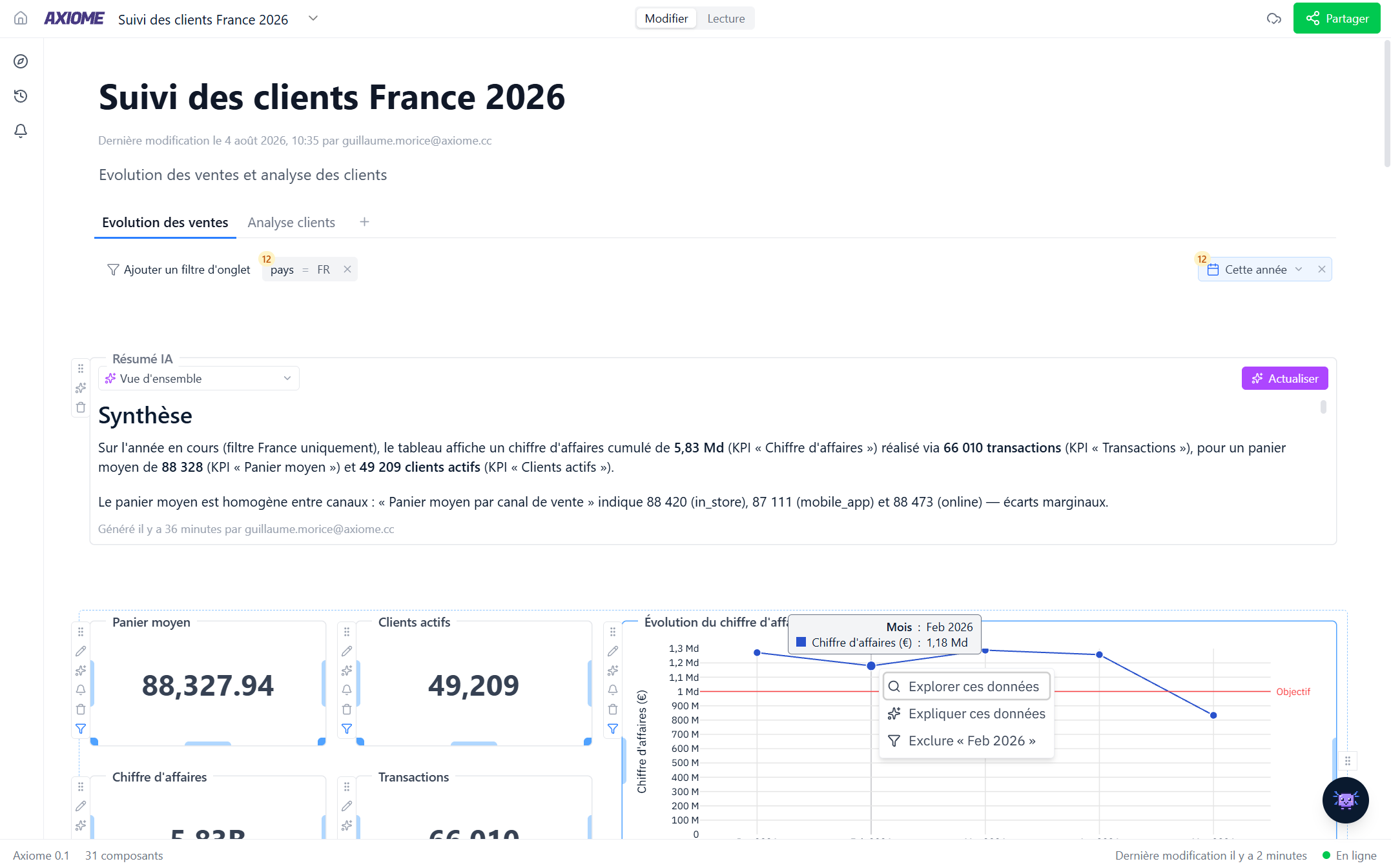
In Edit mode, click any point on a chart:
- Explore this data — see the rows behind the number.
- Explain this data — Axi investigates what's driving the value and tells you if it looks unusual.
- Filter out — remove that value from the chart.
Click the SQL button in the chart editor to see the exact database query behind the chart. You never need it, but it's there. (KPI cards have the same button; tables don't.)