Creating and layout
Create a dashboard
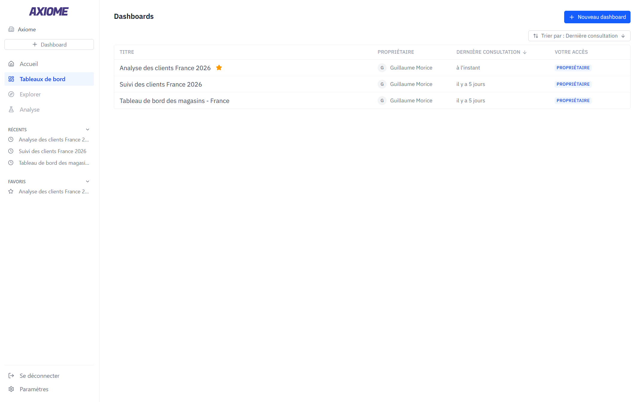
From Home or the Dashboards page, click New dashboard. Give it a title and, if you like, a description — both editable right on the page.
The Dashboards page lists everything you own or that's shared with you, with the owner, your access level, and when you last viewed it. Sort the list, mark favorites (they stay pinned in the sidebar), or remove a dashboard from your list.
From a dashboard's top bar you can Favorite, Duplicate, Share, or Delete it. Only the owner can delete a dashboard.
Add widgets
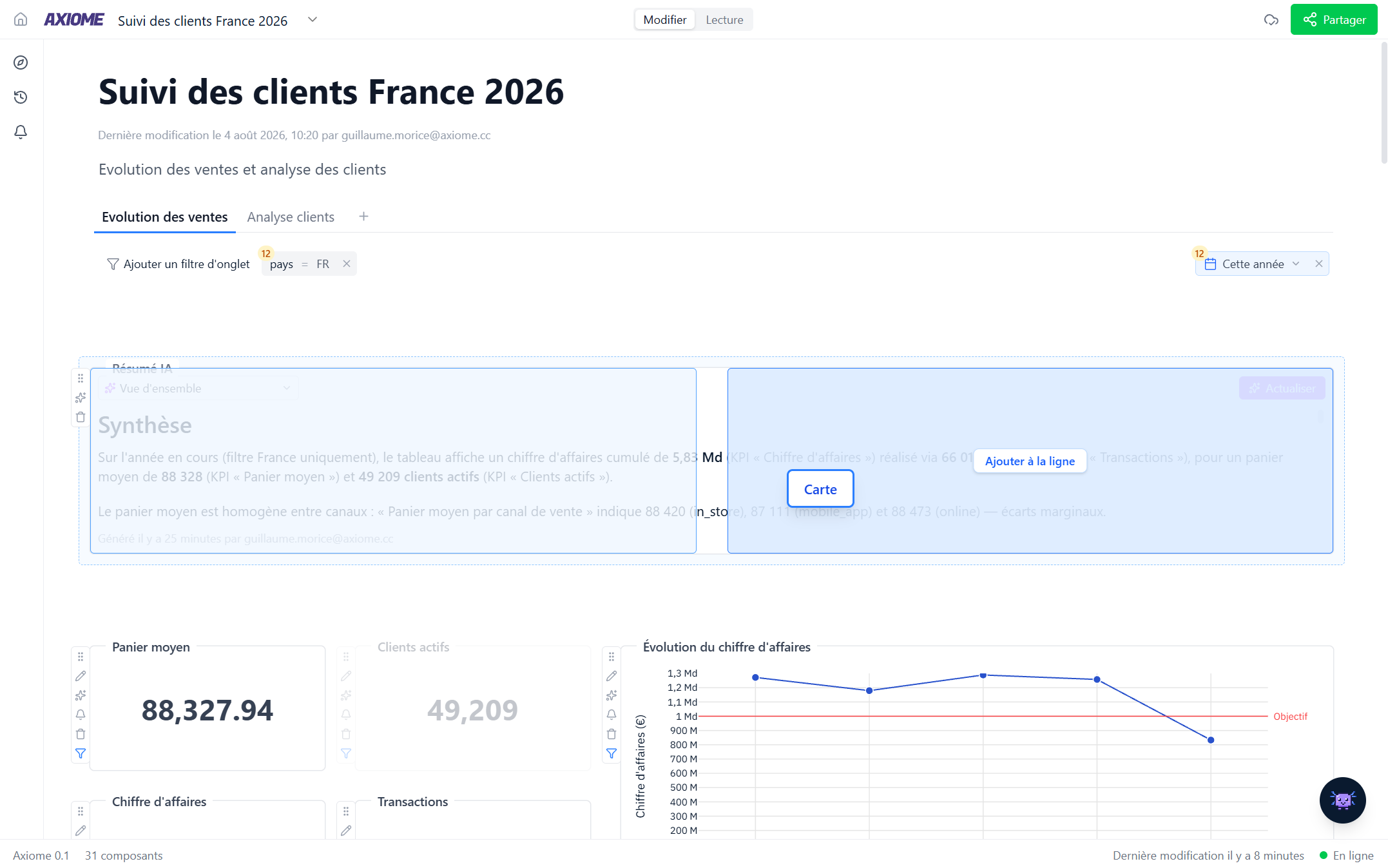
Add a widget — Chart, Table, Card, Text, or AI summary — from the dashboard, or simply ask Axi to build it for you. An empty dashboard suggests ideas like "Show me a chart of monthly revenue" to get you started.
Each widget opens its own editor — see the Widgets section.
Arrange the layout
Dashboards are organized as rows of widgets:
- Move a widget: hold it, then drag. Drop it into an existing row, stack it, or drop it on a new row.
- Resize by dragging the left, right or bottom edge, or a bottom corner.
- Move a whole row with the row handle.
- Insert a row between two existing ones.
Widgets in the same row share its height — the grid keeps everything aligned for you.
Edit mode and View mode
A dashboard opens in one of two modes, switched from the toggle in the top bar:
- View — reading mode. Data is live and always current, but nothing can be moved or changed by accident. Tab filters are shown so you know what the numbers are filtered on, but they can't be changed from here.
- Edit — the full toolbox: add, configure, move, resize, and delete widgets — and change the tab filters.
If a dashboard was shared with you in View access, it stays in View mode — the toggle is for people who can edit.
Everything on this page below assumes Edit mode.
The dashboard sidebar: Explore, History, Alerts
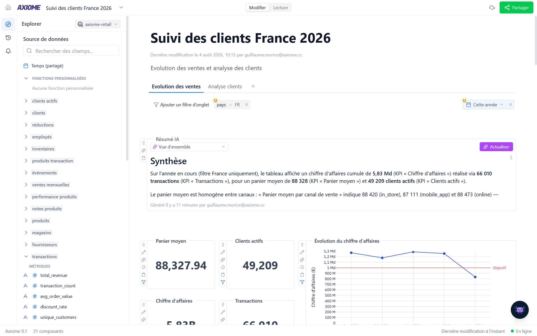
On the left edge of every dashboard, a slim sidebar gives you three panels:
- Explore — browse the data available to you before (or while) building. Pick a data source in the selector at the top, then walk through its tables and their fields — dimensions, measures, and metrics, with their descriptions. It's read-only: a map of what you can ask Axi or put on a chart. Click Data map in the panel header to see those tables laid out visually, with the relationships between them.
- History — everything that happened on this dashboard, by whom, and when. See History.
- Alerts — every alert and scheduled report on this dashboard, with its status and last delivery. See Alerts and reports.
Interact with the widgets
- Hover a widget and click the pencil — Edit chart, Edit table, and so on — to open its editor. A widget you haven't configured yet opens on a single click anywhere on it.
- Click a point on a chart to explore the rows behind it, have Axi explain it, or filter the value out — see Explore a data point.
- Hold and drag to move; pull the edges to resize.
- Click the bell on a KPI card or chart to get alerted when its value moves — see Alerts and reports.
Auto-save and real time
There is no save button: every change is saved automatically, immediately. The footer shows you the connection status (Online/Offline) and when the dashboard was last edited.
Dashboards are live for everyone. If a colleague — or Axi — edits a widget while you're looking, you see the change happen. Every change also lands in the History panel.